Coding Animation Interaction Design
Using Web Technologies for a “Pull to Refresh” Animation
· 4 Minutes / 1,138 Words
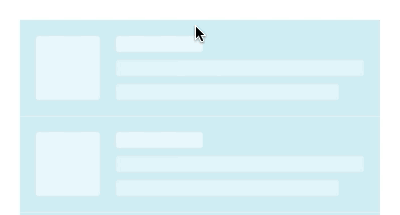
Pull-to-refresh is a touchscreen gesture used in many mobile applications. This article shows a way of creating a simple pull-to-refresh animation using web technologies. The animation has seven different parts implemented with SVG, CSS and JavaScript.
Pull-to-refresh first appeared in the Tweetie app in 2008, which was later aquired by Twitter. The company now owns a patent regarding the design pattern. This hasn’t stopped developers from using it ubiquitously, as Twitter agreed to “only use his patent defensively”.
The motion design for this animation isn’t mine, but the link I’ve saved returns a 404 page. If you know the motion designer or have stumbled across my original inspiration please tell me so in the comments.
The following sections explain the different parts of the animation. You can try the final pull-to-refresh animation in a live CodePen at the end of the article.
Interaction
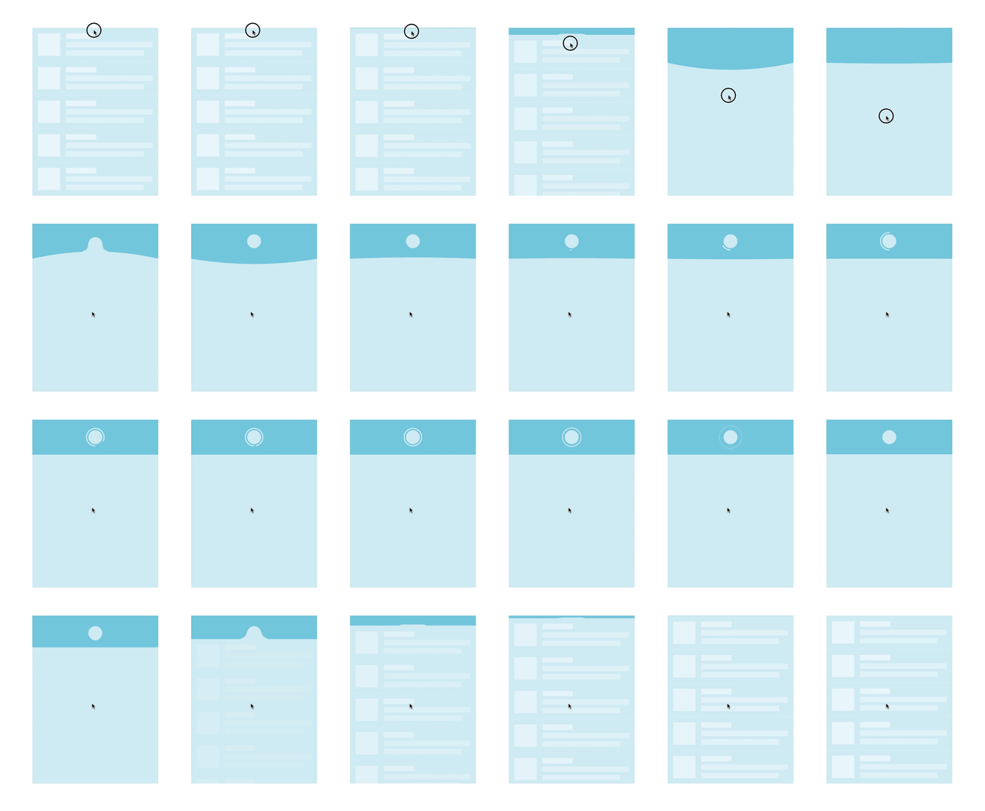
The interaction consists of grabbing, dragging and releasing. Therefore event listeners for the start, drag and end of the pull-to-refresh gesture are added.
The drag listener lets the user pull until a certain threshold via listening to e.clientY || e.changedTouches[0].clientY. If the user lifts their finger or releases their mouse button before the threshold the card returns to its initial position. If the users pulls further than the threshold the card gets bend.
This continues to a second threshold which starts the rest of the animation. While the animation is playing all event listeners are removed, so no unforeseen things can happen.
Bending the card
The card is initally a simple rectangle, implemented as an SVG path. Bending of the card is done via replacing parts of the path with a quadratic Bézier curve.
<path id="card" d="M0,0 H360 V480 H0"/>The helper function setCardPath() takes two arguments for defining the quadratic Bézier curve. After Q in the path description you can define the control point and the end point of the curve. The start and end point are on the same position y1, which is the threshold defined in the first event listener. Changing the control point at (180, y2) bends the card.
const setCardPath = (y1, y2) => {
    var d = "M360,480 H0 V" + y1 + " Q180," + y2 + " 360," + y1;
    $card.setAttribute('d', d);
};
Animation via JavaScript
After bending the card until a certain threshold the animation continues without the user’s influence. Some parts are then animated with requestAnimationFrame() in JavaScript, all of which follow the recursive structure in the code snippet below.
let start;
const duration = 1250;

const animation = timestamp => {
    if (!start) {
        start = timestamp;
    }

    const progress = timestamp - start;

    /* Animation... */

    if (progress < duration) {
        requestAnimationFrame(animation);
    }
};

requestAnimationFrame(animation);
Oscillating the card
Oscillating the card is achieved using the two concepts from the previous sections. The setCardPath helper is used in a recursion animation function for animating a simple harmonic motion.
const amplitude = 100 - easing.easeOutCubic(progress / duration) * 100;
const time = 3 * (progress / duration);
const y = amplitude * Math.cos(6.283185 * time);
The phase φ is 0 and the frequency f is 1. This sets the angular motion ω to 2π, making the equation even simpler. Damping of the harmonic motion is achieved with a cubic easing equation.
Water droplet with gooey effect
The water droplet is a circle that gets fused with the card. This is achieved with the help of an SVG filter which we have to apply to both shapes.
<g filter="url(#goo)">
    <use xlink:href="#card"/>
    <circle id="circle" cx="180" cy="50" r="20"/>
</g>
The circle itself is always in front of the card. It has the same color as the card and can therefore not be seen. As soon as we add the animated class via JavaScript it receives a CSS transformation.
#circle {
    transform: translate(0, 100px);
    transition: none;
    &.animated {
        transform: translate(0, 0);
        transition: all .25s .05s ease-out;
    }
}
The gooey effect is well explained in the article The Gooey Effect. The basic concept is blurring two graphical elements and then sharpening the edge by increasing the contrast of the alpha channel.
<filter id="goo" filterUnits="userSpaceOnUse" x="130" y="0" width="100" height="100">
    <feGaussianBlur in="SourceGraphic" stdDeviation="11" result="blur"/>
    <feColorMatrix in="blur" mode="matrix" values="1 0 0 0 0  0 1 0 0 0  0 0 1 0 0  0 0 0 19 -7" result="contrast"/>
    <feComposite in="SourceGraphic" in2="contrast" operator="atop"/>
</filter>
After blurring the elements a feColorMatrix filter let’s us specify a transformation matrix for changing pixel colors. In this example we multiply all alpha values by 19 and then subtract 7 × 255. This means that all alpha values greater 94 stay visible, while all alpha values smaller 94 become fully transparent.
Animating the circular progress indicator
The progress indicator is an SVG arc, that is set to correct position with the help of a group. This way we can specify the path from its local coordinates of (0, 0), making the calculation simpler.
<g transform="translate(180, 50) scale(1, 1) rotate(90)">
    <path id="progress"/>
</g>
We have a fixed starting point at (25, 0), which is to the right of the center. The radii of our arc are (25, 25). We then move a point in a circular motion around the center, which are our x and y values. The largeArcFlag determines if the arc should be greater than or less than 180 degrees.
const setProgressPath = percent => {
    const x = 25 * Math.cos(percent * 6.283185);
    const y = 25 * Math.sin(percent * 6.283185);
    const largeArcFlag = percent <= 0.5 ? 0 : 1;
    const d = "M25,0 A25,25 0 " + largeArcFlag + " 1 " + x + "," + y;
    $progress.setAttribute('d', d);
};
The end of the loading process is signaled by a “bubble burst” of the progress indicator. This is done in CSS by animating the opacity, stroke width and size.
#progress {
    opacity: 1;
    stroke-width: 3px;
    transform: scale(1, 1);
    transition: none;
    &.animated {
        opacity: 0;
        stroke-width: 0px;
        transform: scale(1.5, 1.5);
        transition: all .35s ease-in;
    }
}
Closing animation
The closing animation is used at the end of the animation or if the users lifts their finger or releases their mouse button before triggering the animation.
const progress = timestamp - start;
const y = position - easing.easeInOutCubic(progress / duration) * position;
setCardPath(y, y);
$content.style.top = `${y}px`;
$content.style.opacity = 1 - (y / 100);
position is either set to the threshold of the trigger or wherever the drag is released if the animation has not been triggered. Add the end of the closing animation all flags are reset and we add all the event listeners again.
CodePen of the final pull-to-refresh animation
If you liked this article, please consider sharing it with your followers.