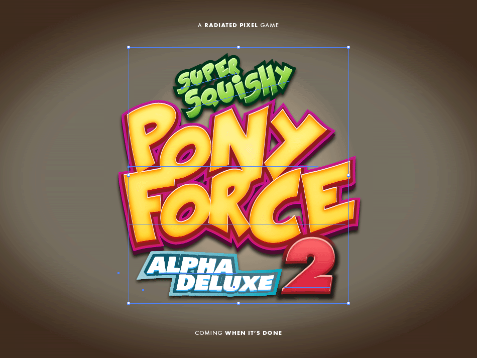
I am currently working on a game prototype with a few friends and we settled on a slightly ridiculous title. To announce our project in a way that it deserves I have created a logo that represents the over the top experience we are aiming for. Several people have asked me how the logo was created, so here you have a short tutorial on how to design an indie game logo in Illustrator.
Briefing
The first step is of course determining what message the logo has to send. In our case it has to show uncompromising fun and that the game does not take itself too seriously (like Broforce for example). Another logical decision is to create vector graphics, so that we can scale the logo for use in promotional material as well.
Typography and Styling
The game itself will be highly stylized and most likely use cartoon shaders. Therefore realism and delicate textures would be the wrong artistic choice for the logo. To hint at the mix of stylized action and fierce competition I have chosen to use Kraash, a highly stylized comic font, and Univers, the classic grotesque typeface, which has a very nice extra bold font weight.
Fills and Effects
When I had my initial idea I jumped right in and tested a few font settings and color schemes. As soon as I was pleased with the overall picture the real fun began. The Appearance panel in Illustrator gives you the possibility to add multiple layers of fills and strokes to your object, as well as effects for each layer or your whole object.
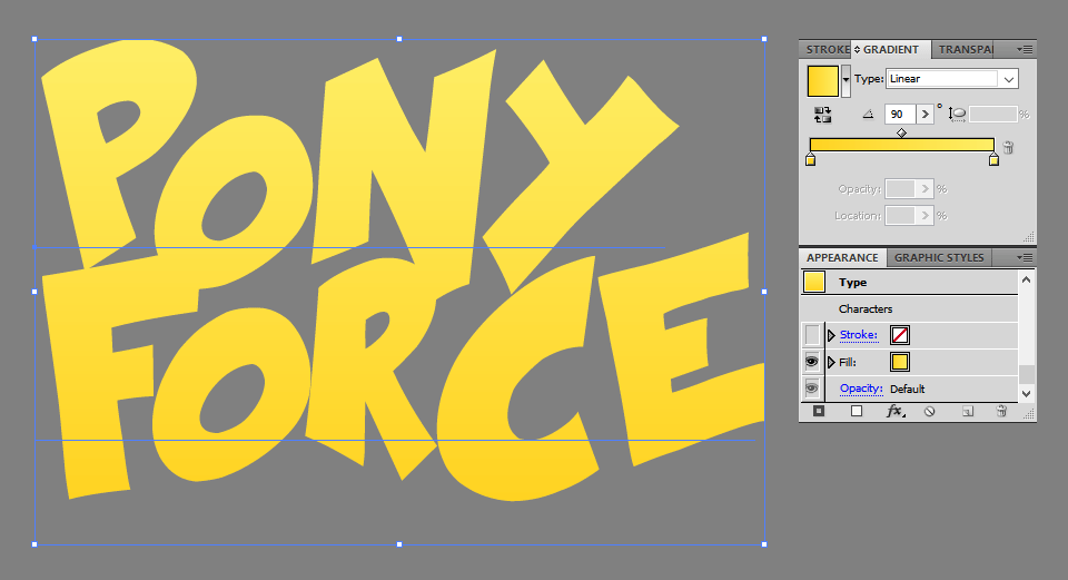
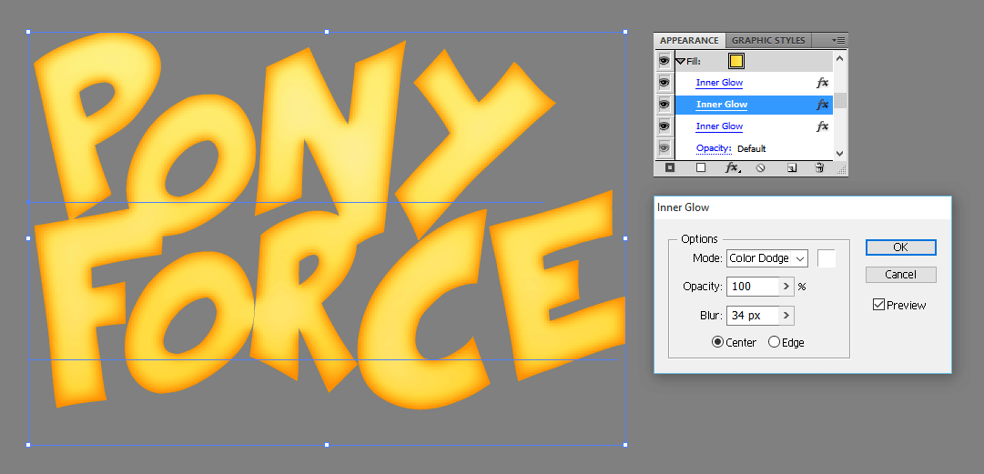
The subtle yellow gradient was enhanced with three glow effects. The first two are duplicates, as one effect with a Color Dodge blend mode is not strong enough. Luckily, they can be stacked (after confirming a dialog).
Volume can be faked by dilating the shape with the Offset Path effect, moving it slightly with the Transform Effect and changing the color. These effects in combination are very powerful.
![]()
The final styles have seven fill layers with various effects and gradients. The last is a Warp effect. I find it incredible, that this is available as an effect in contrast to the Envelope Distort, which also lets you apply deformations, but is slightly difficult to handle when changing the styles of the contained objects.
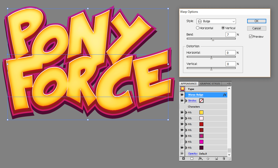
The other elements got the same treatment and were then combined to the final result. To finish it off I added a subtle bulge to the layer. I then used the image with the earthy gradient as an announcement teaser.
If you have thoughts about this post please let me know on Facebook or Twitter. If you got inspired and created a logo design of your own I would of course love to see it.